Material-UI: Building Beautiful React UIs with Material Design
The world of web development is constantly evolving, and creating visually appealing user interfaces has become a key aspect of building successful applications. One framework that has gained immense popularity in the React community for creating beautiful UIs is Material-UI.
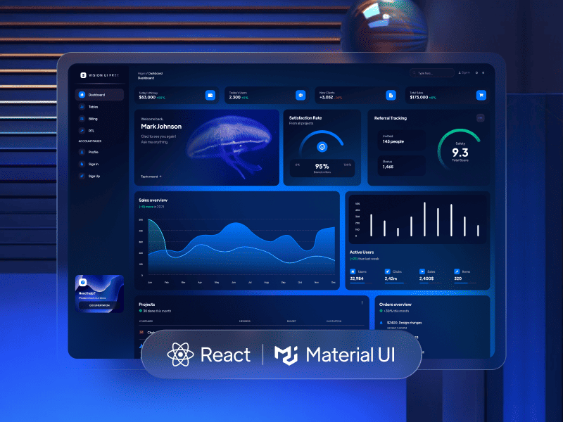
Material-UI is a comprehensive React UI library that implements the principles of Material Design, a design language developed by Google. Material Design focuses on delivering a clean, modern, and intuitive user experience by utilizing subtle animations, consistent typography, and thoughtful use of color and depth.
With Material-UI, developers can leverage various pre-designed components, styles, and themes to quickly build stunning user interfaces that adhere to Material Design guidelines. Whether working on a personal project or developing a professional application, Material-UI provides the tools and resources to easily create visually appealing and responsive UIs.
By the end of this blog, you will have a solid understanding of Material-UI, why it is a popular choice for React development, and how it can help you create visually stunning and engaging user interfaces. So, let’s dive in and explore the exciting world of Material-UI!
What is Material-UI?
Material-UI is one of the most popular React UI libraries available, designed to make it easier for developers to create visually appealing user interfaces that follow the principles of Material Design.
As a React UI library, Material-UI provides a wide range of pre-built components, styles, and themes that can be seamlessly integrated into your React projects. These components are designed with flexibility and reusability , allowing you to develop UIs with consistent styles and behavior rapidly.
By using Material-UI, you can save time and effort in designing and implementing UI elements from scratch. The library offers a comprehensive set of components, including buttons, forms, navigation menus, modals, and more, which can be easily customized to fit your application’s specific needs.
Moreover, Material-UI ensures responsiveness, making your UIs look great on different screen sizes and devices. It also provides extensive documentation and resources, making learning and getting started with the library easy.
Whether you’re a beginner or an experienced React developer, Material-UI simplifies building attractive and functional user interfaces. Its intuitive API and extensive component library empower you to create visually stunning and user-friendly applications while adhering to the principles of Material Design.
How to Get Started with Material-UI
To get started with Material-UI in your React projects, follow these steps:
- Installation: Start by installing Material-UI as a dependency in your project.
- Integration: Once installed, you can import Material-UI components into your React components and start using them.
- Styling: Material-UI offers multiple ways to style your components. You can use inline styles, CSS-in-JS solutions like styled-components or emotions, or even apply global theme customization. Explore the documentation to find the styling approach that suits your preferences.
- Component Usage: Utilize the wide range of Material-UI components available to build your UI. From basic elements like buttons and forms to complex components like navigation menus and modals, Material-UI provides a comprehensive set of UI building blocks.
- Responsive Design: Material-UI ensures responsive design by default. You can use its Grid component and responsive breakpoints to create responsive layouts that adapt to different screen sizes and orientations.
- Theming: Customize your application’s overall look and feel by leveraging Material-UI’s theming capabilities. You can create and apply custom themes to achieve a consistent, personalized design throughout your app.
Designing with Material-UI
Material-UI simplifies designing visually appealing interfaces by providing components and guidelines based on Material Design principles. Here are some key aspects of designing with Material-UI:
- Material Design Principles: Familiarize yourself with the core principles of Material Design, such as elevation, depth, and meaningful motion. Understanding these principles will help you create UIs that feel natural and intuitive to users.
- Consistent Styling: Material-UI ensures consistency in styling by providing a set of predefined themes and color palettes. Use these themes and palettes to maintain a cohesive look across your application and adhere to Material Design guidelines.
- Responsive Layouts: Material-UI’s responsive design features, including the Grid component and responsive breakpoints, allow you to create layouts that adapt to different screen sizes and devices. Design your UI to be mobile-friendly and provide a seamless user experience across platforms.
- Typography and Icons: Material-UI offers a wide range of typography styles and icons to enhance the visual appeal of your UI. Choose appropriate typography and utilize icons to communicate information effectively and create a visually engaging experience.
- Animation and Transitions: Material-UI provides built-in animation and transition components to add smooth and subtle animations to your UI elements. Utilize these features to create delightful interactions and improve the overall user experience.
Customizing Material-UI Components
Material-UI provides various customization options to ensure your UI meets your application’s unique design requirements. Here are some ways you can customize Material-UI components:
- Styling Options: Material-UI allows you to apply inline styles directly to components using the style prop. You can also leverage CSS-in-JS solutions like styled-components or emotions to create custom component styles.
- Overrides: Material-UI provides an overrides feature that allows you to selectively override the default styles of components.
- You can customize the appearance and behavior of individual components to match your design preferences.
- Theming: Material-UI’s theming feature enables you to create and apply custom themes throughout your application. To achieve a consistent and personalized design, you can customize various aspects, such as colors, typography, spacing, and more.
- CSS Classes: Material-UI components come with predefined CSS classes that you can target and customize using CSS. This gives you granular control over the styles applied to specific components.
By leveraging these customization options, you can tailor Material-UI components to suit your application’s visual design, ensuring a cohesive and personalized user experience.
Wrapping Up
Material-UI stands out as one of the top React UI libraries for building beautiful user interfaces. With its extensive collection of pre-designed components, flexible styling options, and seamless integration with React, Material-UI simplifies the creation of visually appealing and user-friendly applications.
Whether you’re a beginner or an experienced developer, Material-UI provides a solid foundation for building modern and responsive UIs. The intuitive API, responsive design features, and theming capabilities make it a go-to choice for developers looking to create stunning interfaces that follow the principles of Material Design.
For all users looking for react UI libraries, kandi is the best place! You can find all the different libraries in one place, which makes it easier for you to develop anything at your convenience and expertise of kandi.
So? What are you waiting for? Try kandi now!!